Manifesto Market
A mobile-first website redesign to 2x reservation-booking conversion.

MY ROLE
UX Intern
TIMELINE
June - August 2025
TEAM
1 Designer
1 Developer
2 Supervisors
TOOLS
Figma
Wordpress
Overview
Manifesto Market, located in the heart of Prague, is a company with the goal to create a physical space that brings together culture, food, and community. With over a dozen restaurants boasting a diverse variety of cuisines, the location cultivates a unique and lively dining experience.
The goal of my internship at Manifesto was to redesign the website to transform traffic towards revenue, and encourage users to make reservations. Therefore, most of my concern for this redesign focused on optimizing call-to-actions and improving navigation intuitiveness.
The Problem
Users aren't being driven towards reservations.
Manifesto's old website was primarily constructed with aesthetics in mind. With bold block-shapes and an eccentric menu bar, usability and accessibility were sacrificed for style. While the website's uniqueness made it stand out in the sea of generic hospitality homepages, its mobile-unfriendly layout and unintuitive navigation structure created a series of roadblocks for the user, making it difficult to make reservations, view menus, or find location information.
- The solution: An overhauled, usability-focused site with the goal of translating site visits into eventual sales.
Research
Understanding our users
I began my design process with a deep dive into user research. Leveraging Google Analytics, I investigated the demographics of the primary user base and how they interacted with the site. This phase revealed critical patterns that set the foundation for every design decision to come.
One of my specific concerns was how users interacted with the reservation system. ResDiary, the widget that Manifesto Market used for reservations, helpfully offered linked analytics with Google, which allowed me to track the percentage of users that interacted with each step of the process.
Note: Step 3 was omitted because it is an optional step.
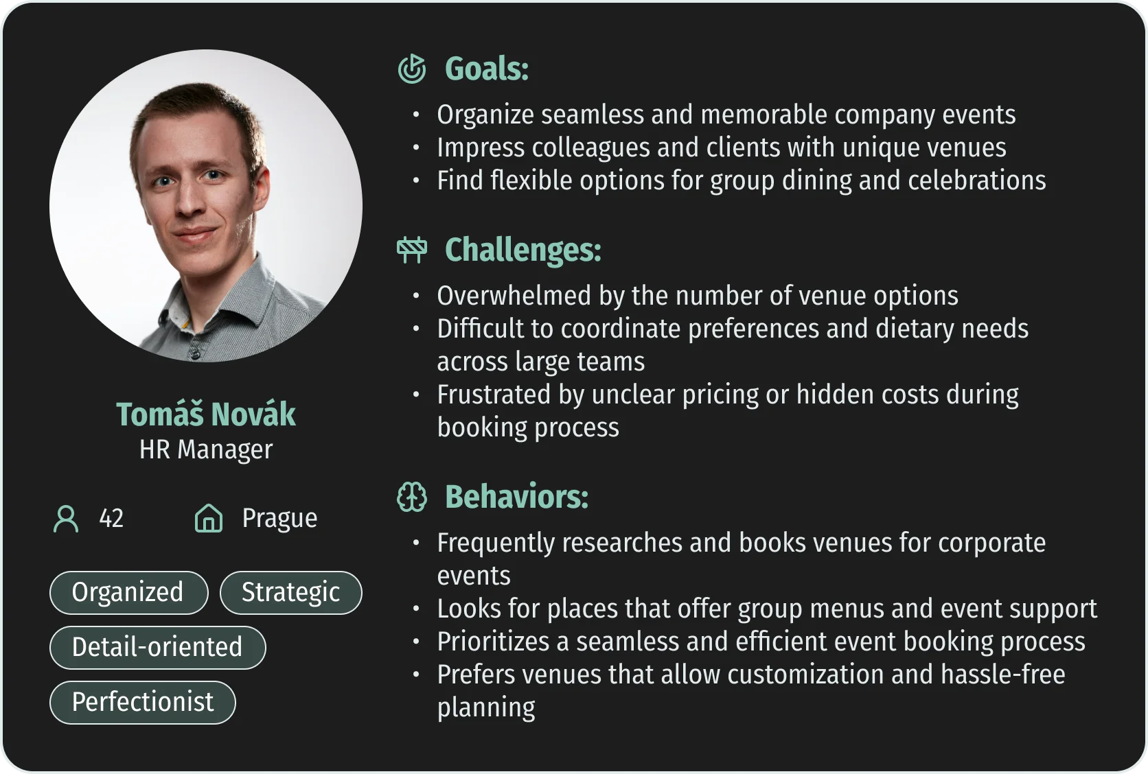
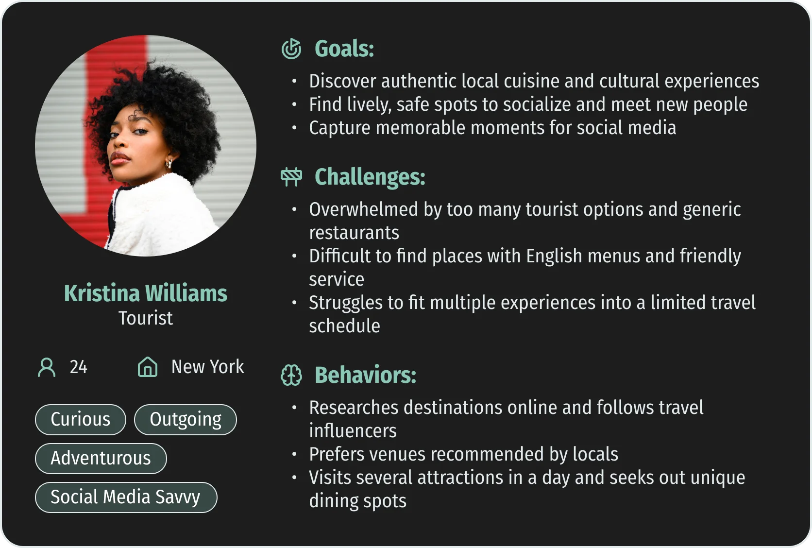
Putting faces to the data
Using my research, I developed detailed user personas to humanize our data and guide empathy-driven design. These personas anchored my design process, ensuring each decision addressed real user needs and motivations.
Getting to the Root
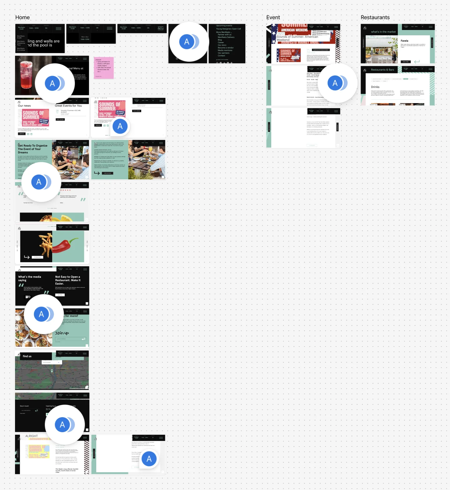
I performed a comprehensive website audit through a UX lens. Every touchpoint was scrutinized for usability, accessibility, and alignment with user goals. This audit exposed high-friction areas: ambiguous CTAs, a convoluted reservation path, and a lack of responsive design.
Key Findings
My research led me to three key findings. These findings highlighted the main challenges users faced, and provided a focused direction for the subsequent design phase.
Conversion is lost in the reservation process.
While more than a quarter of users land on the reservation widget, more than 80% of those users exit the page immediately. The sharp decline suggests that call-to-actions are either misleading or confusing.
User diversity reflects an international audience.
The dominance of non-Czech languages (70.7%) suggests that tourism is a large driving force for Manifesto's audience, indicating that optimizing multilingual support is critical.
Mobile-first is essential.
76.3% of active users accessed the site on mobile devices, emphasizing the need for a mobile-first design approach.
Design
Putting it all together...
With insights from research, personas, and audit findings, I moved into ideation and prototyping. My design approach was conversion-driven, removing obstacles discovered in earlier stages.
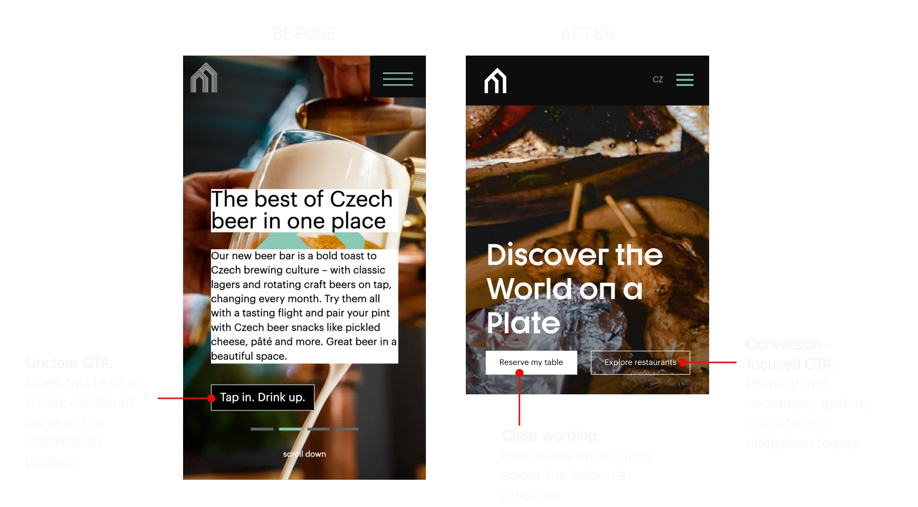
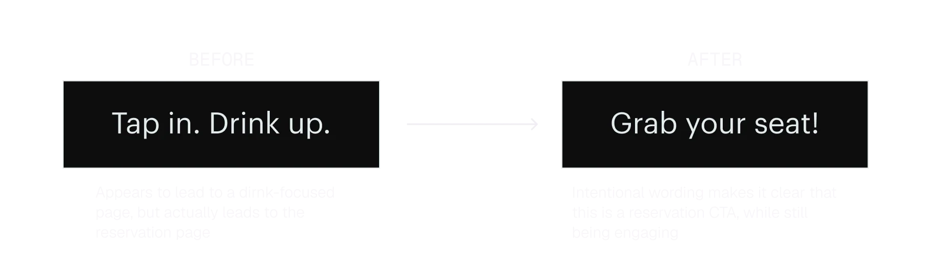
CTAs built for conversion
For the hero section's CTAs, I focused on intentional, actionable language.
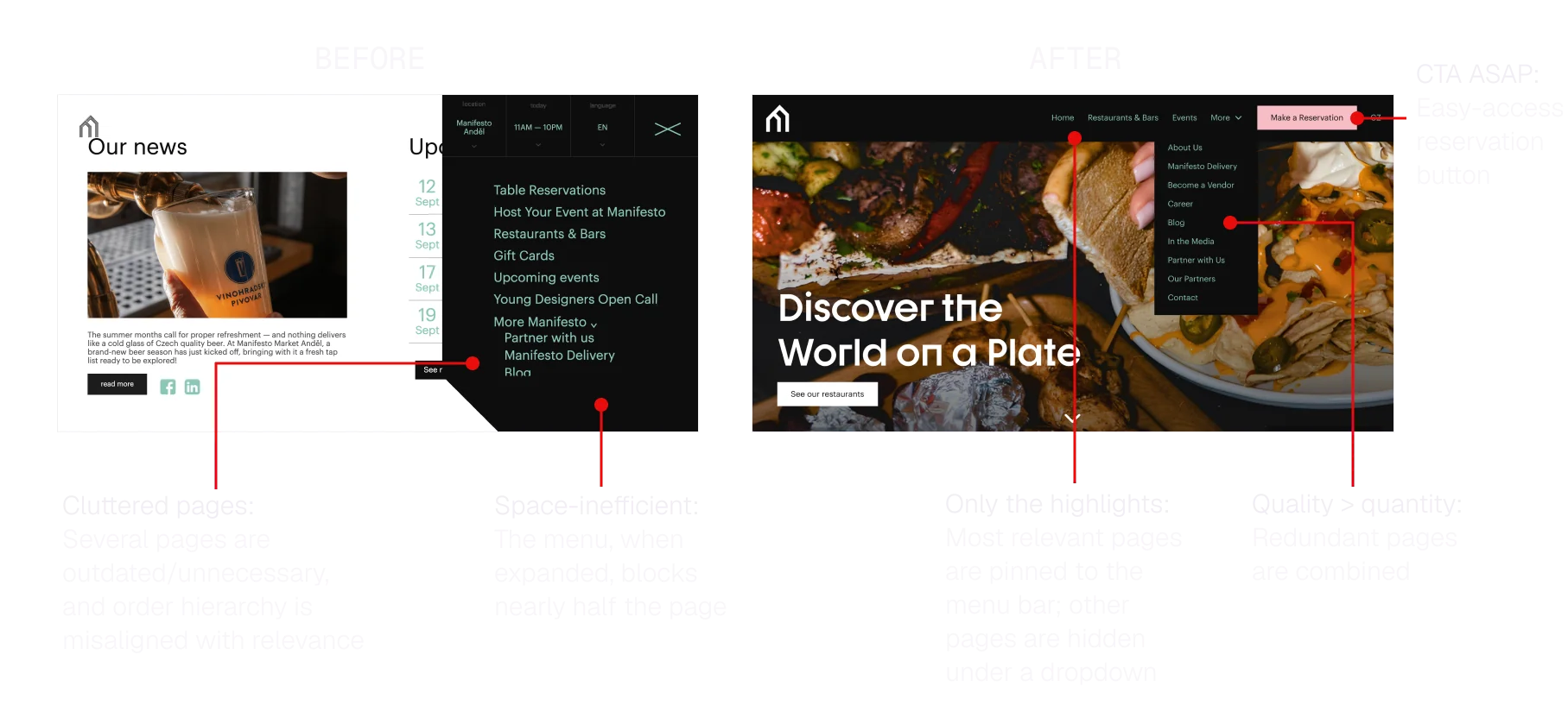
Intuitive navigation
I reorganized the website's navigation menu, minimizing content obstruction and highlighting the most relevant pages.
Unexpected limitations...
Because my supervisor had been away and recovering from illness, communication had been limited. Once I shared my redesign proposal, I came to understand that several of my ideas weren't possible within the constraints of the company's website builder.
With this in mind, I refocused my goal to what I could improve: call-to-action text. I shortened my pitch, highlighting UX writing issues and identifying problematic button text to improve reservation conversion.
Impact
121% increase in reservation conversions from the reservation page.
Updating the primary hero CTA guided more users to the reservation flow with clear intent.
Adapting the project for a new vision.
Martin Barry Group, the organization behind Manifesto, recently launched Kalle Halle. Many of my ideas involving CTAs and navigation will be utilized there.
Creating a mobile-friendly experience.
By prioritizing users on smaller screens, the website meets the needs of the majority who browse on their phones.
Takeaways
Data is everything.
- Using Google Analytics was pivotal in understanding how users were actually interacting with the site. This was my first time using Google Analytics extensively, and I was wowed by all of its capabilities.
Understand the limitations first.
- I jumped into this project head-on without a complete understanding of what was plausible within the confines of the pre-made website builder. In the future, fully comprehending the limitations of the project is a top priority!