Workup
Restructuring an AI-powered interview tool to empower students to prepare with confidence.

MY ROLE
Product Designer
TIMELINE
January - June 2025
TEAM
14 Designers
1 Product Team
TOOLS
Figma
Overview
Workup is an AI-powered professional networking app that aims to combine social media and job searching. With a feed that highlights career-centered content, and numerous AI-powered tools to prepare users for recruitment, Workup makes it easy to land a dream job.
My specific role in the project was to improve the usability of Workup's AI interview feature. Although the feature had great potential and strong use cases, the confusing UI was prone to causing frustration for the user.
The Problem
Preparing for interviews can feel overwhelming.
For college students or new graduates, it can be intimidating trying to craft the perfect responses, especially when you don't know what to expect. By allowing users to conduct industry-tailored mock interviews and receive AI-assisted feedback, Workup's AI Interview feature provides students with clear guidance.
However, although this feature's capabilities were impressive, users found it difficult to navigate. Many users reported feeling discouraged or frustrated by the cluttered interface.
- The solution: A restructured user flow to minimize friction in the interview practice experience.
Research
Understanding the Current Market
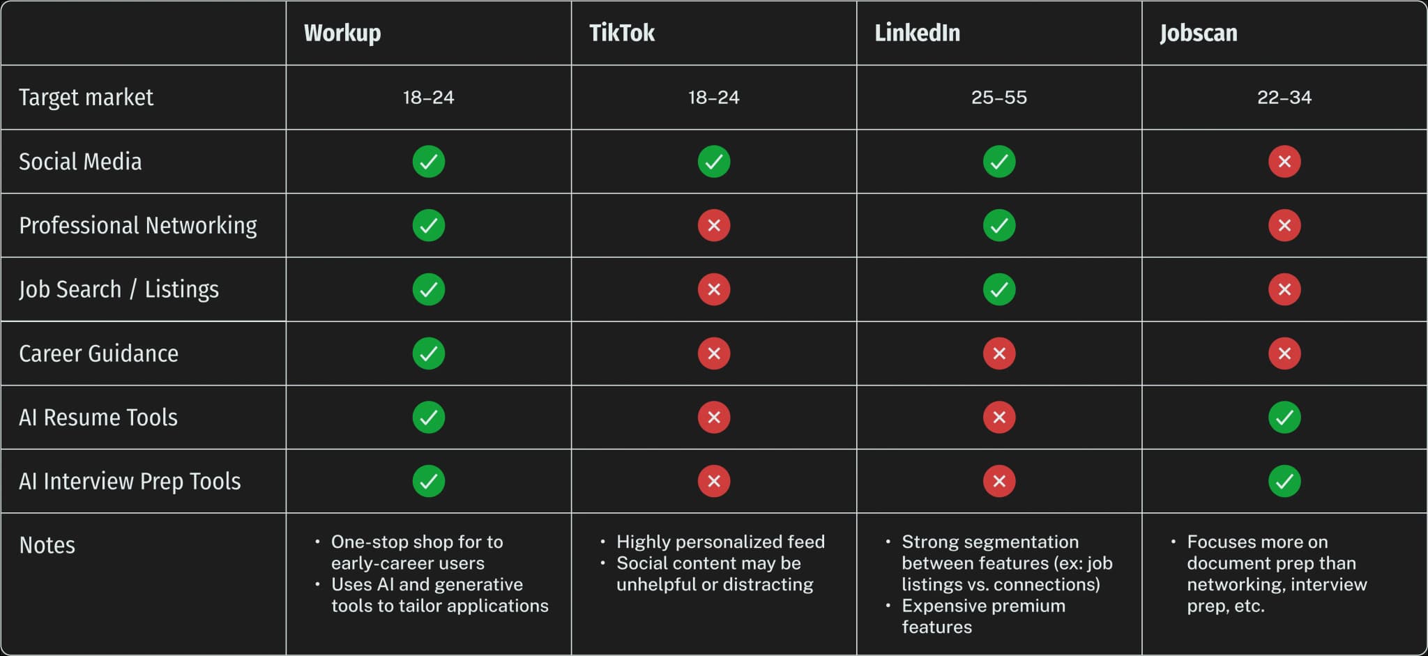
We started with competitive analysis to compare existing platforms that also offered social networking and career development features.
Understanding Users
To understand user perspectives, we administered 50+ surveys and conducted 20+ interviews for Workup's target audience, job-seeking college students. Our research gave us a preliminary understanding of how college students interacted with AI tools in the job search process.
"I use ChatGPT's voice function to do mock interviews. My main issue is that it seems more like a list of technical questions rather than an actual organic interview process."
"[AI's] answers are too general [...]. It mainly helps with generating questions."
"[AI interview questions] either are too broad in their questions or too niche."
"I don't know if AI questions will be representative of what will actually be asked. They may be unreliable or biased."
Getting to the Root
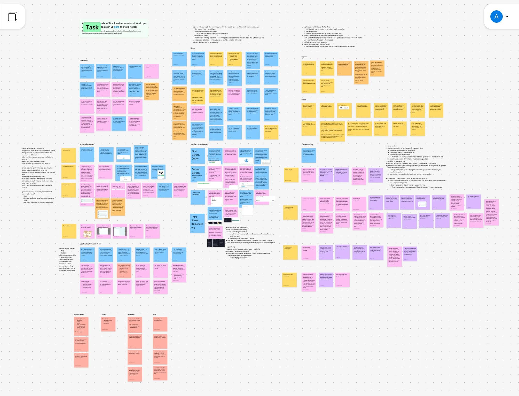
With a newfound understanding of user motivations and challenges, our team put together a detailed design audit of the current Workup website.
Key Findings
An unclear user flow leaves users confused.
Many users struggled to understand where to begin or how to proceed through the interview feature.
Feedback formatting overwhelms users.
The AI-generated interview feedback was formatted as a dense wall of text, making it difficult for users to quickly identify actionable insights.
Lack of organization options limits usefulness.
Users were unable to easily save question sets or review past interviews, making it difficult to track progress over time.
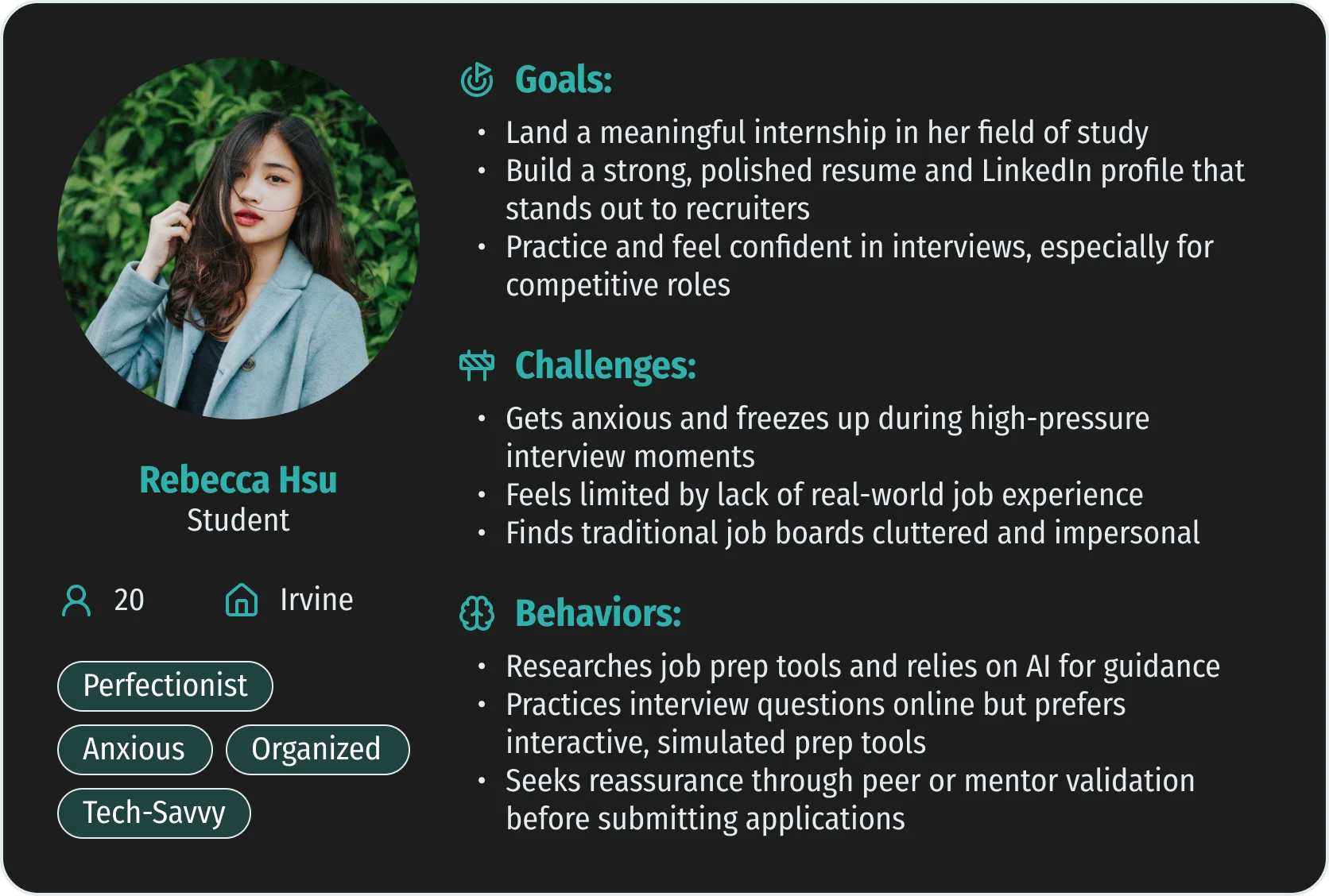
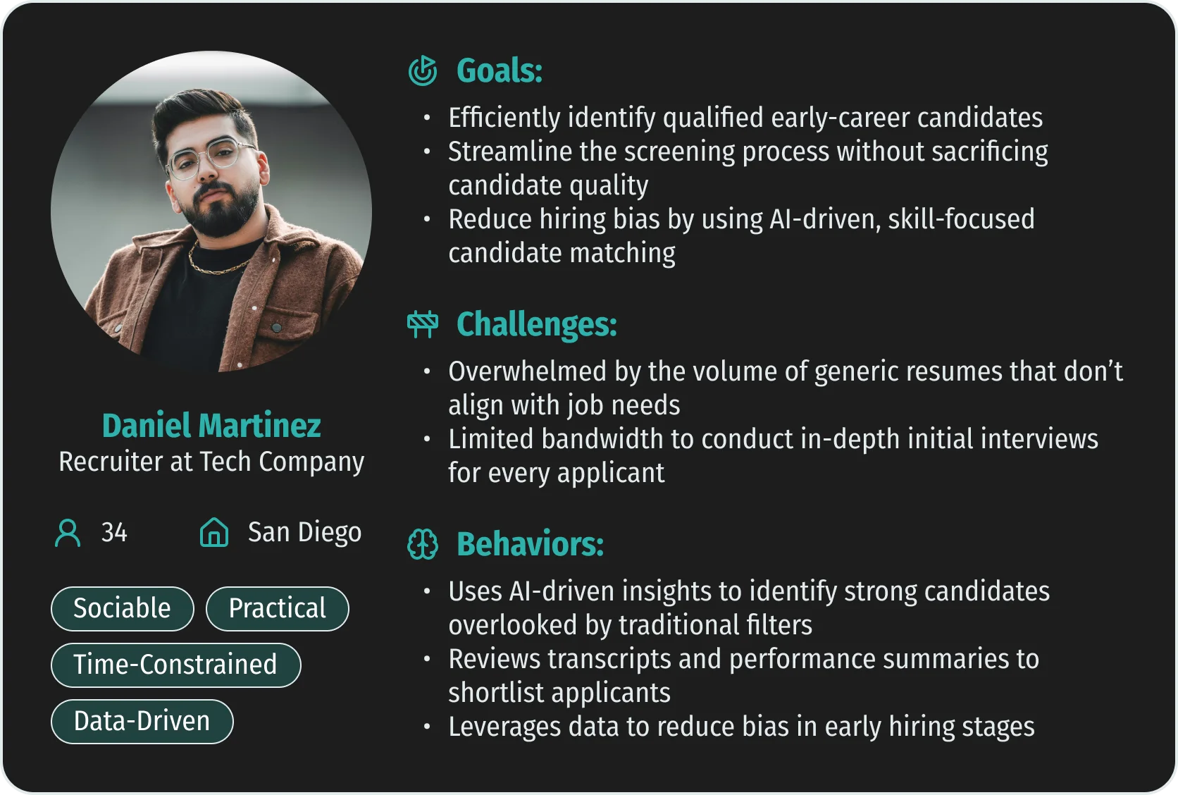
Putting Faces to the Data
Using our research, I developed detailed user personas to humanize the data and guide empathy-driven design.
Project Goals
Empower confident preparation.
Enable users to practice interviews and receive actionable AI feedback.
Streamline the user journey.
Design an intuitive user flow that minimizes friction and confusion.
Support continuous improvement.
Provide organizational tools so users can track their progress.
Design
Putting it all together...
With insights from research, the audit, and user personas, my team began the design process. We began with a thorough analysis of Workup's current AI Interview feature.
Problem Group 1
Redundant empty pages disrupt interview setup
Problem Group 2
Customization features feel disconnected
Problem Group 3
Lengthy offboarding creates friction
Low-Fidelity Designs
The primary challenge with Workup's interface was the lack of a clear user flow. For our lo-fi designs, my team aimed to create interfaces that felt effortless to interact with.
Creating a Design Language
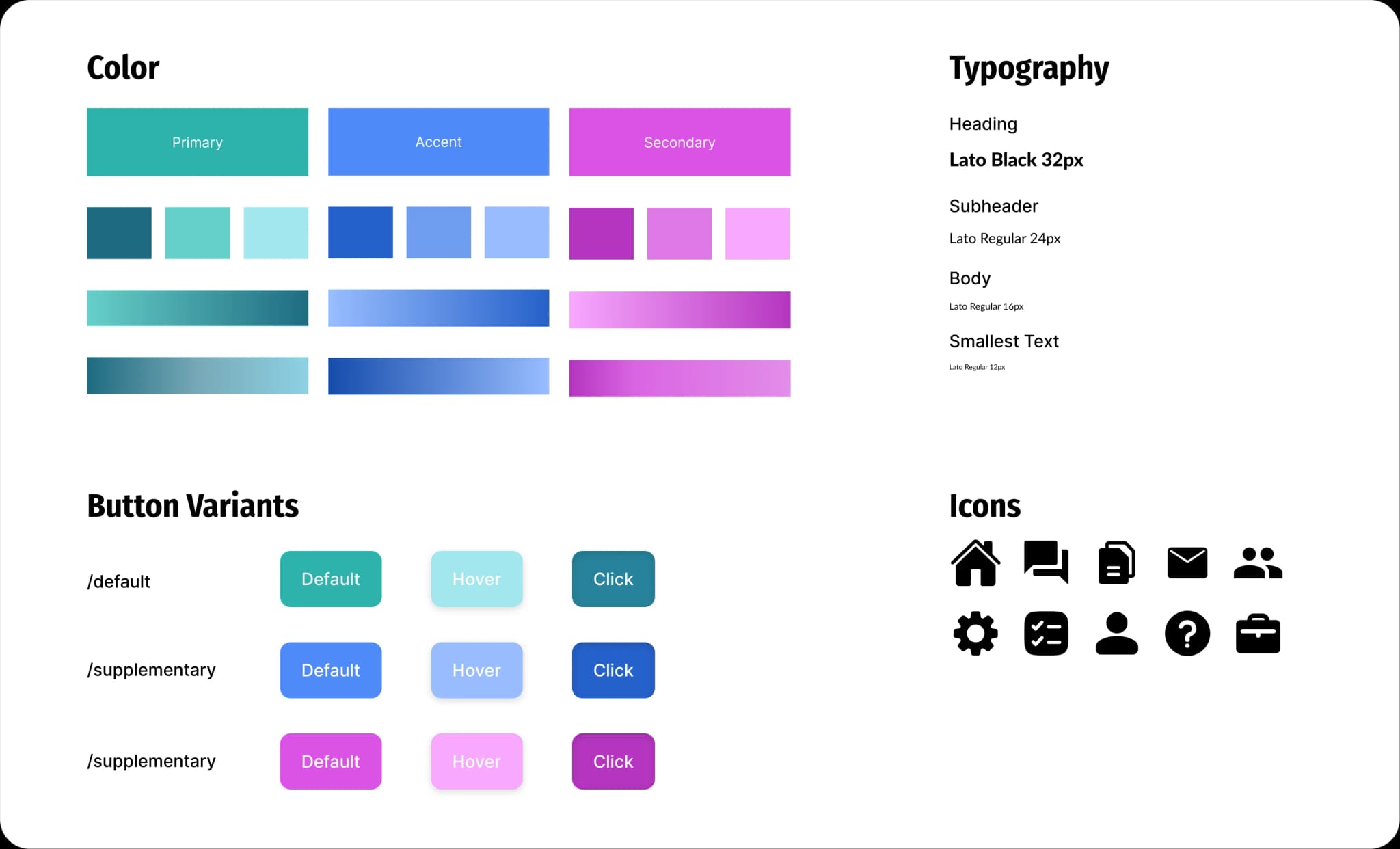
One of the key issues with Workup's interface was its lack of a consistent design system. Based on its existing UI, our team revamped Workup's design system.
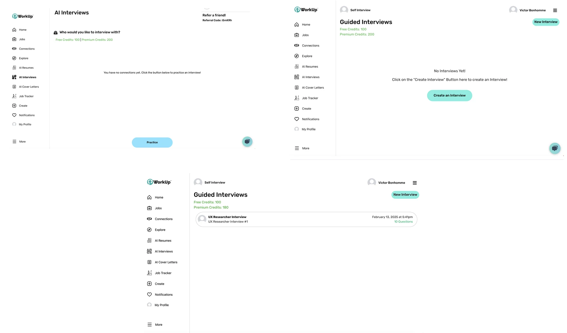
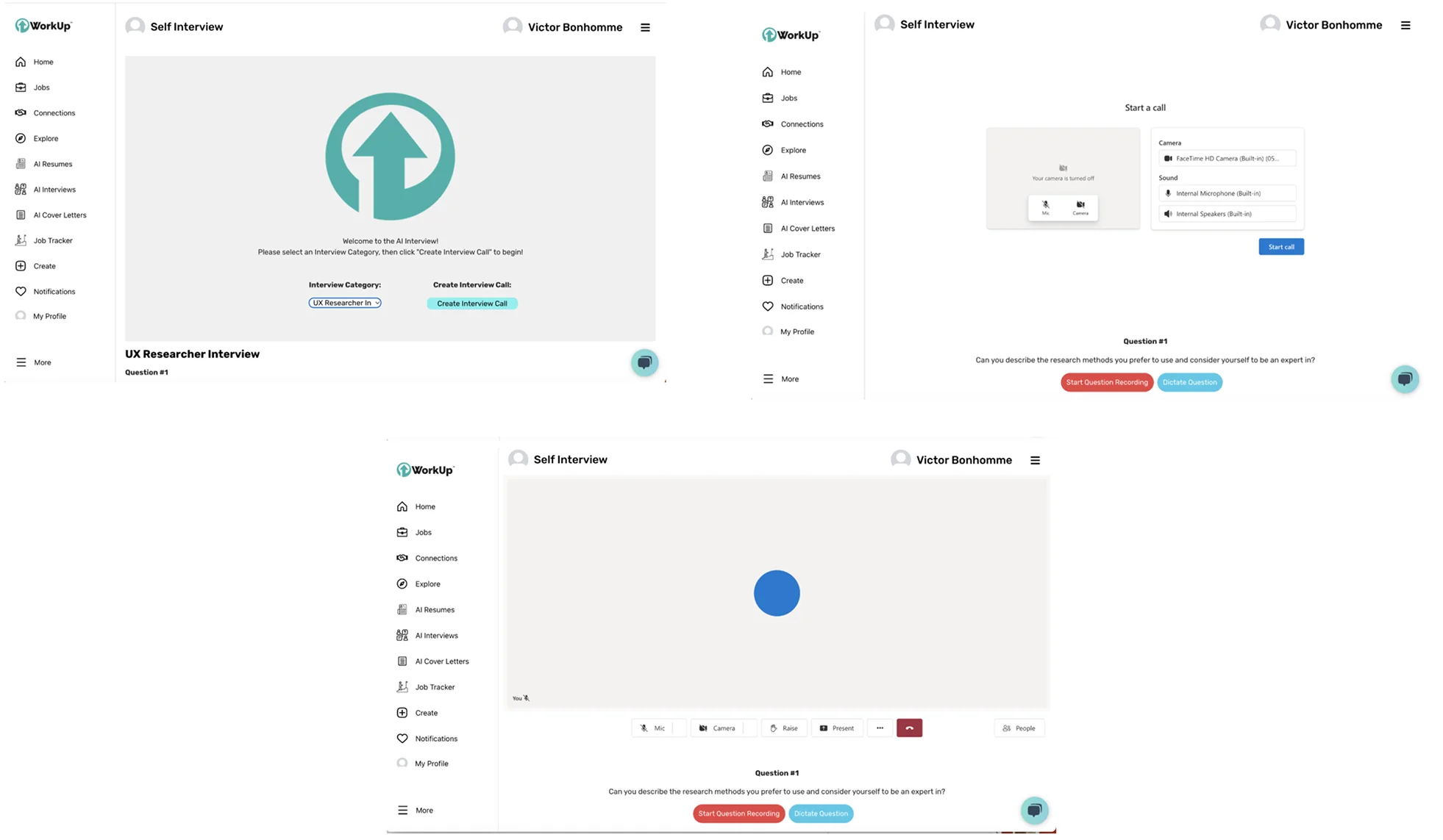
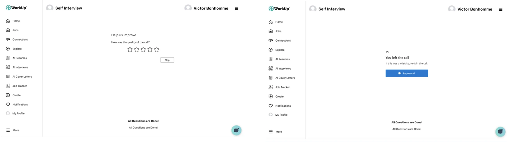
Final Product
The final design for Workup's AI Interview streamlines the user journey, making every step clear and intuitive.
Practice built for perfect
To make the interview creation process as intuitive as possible, I took inspiration from video calling platforms such as Zoom and Google Meet to create an interface that felt like second nature. For the user, this helps make the practice round feel as close as possible to the real thing.
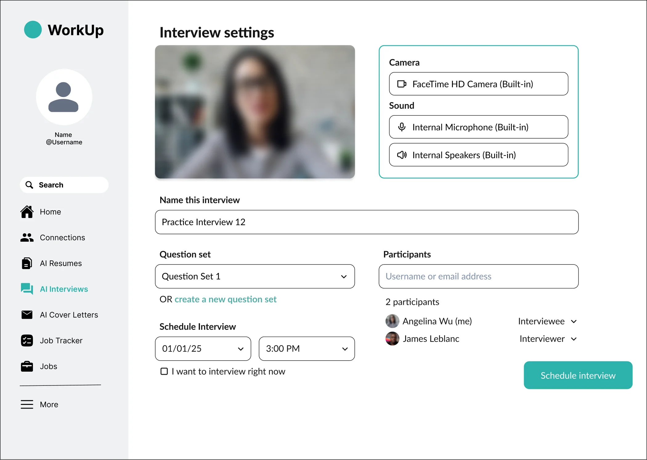
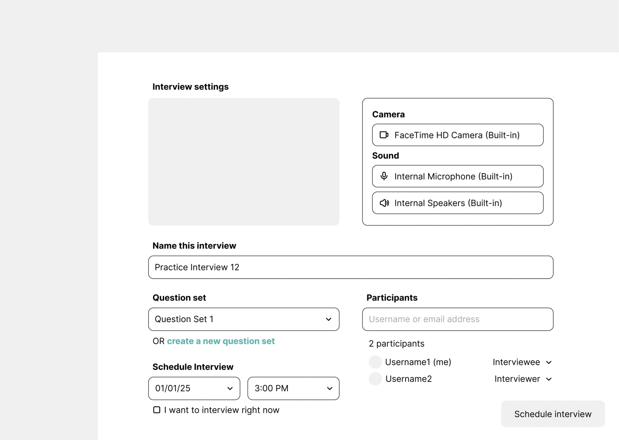
Scheduling that feels seamless
By replacing uncertainty with structure, we turned interview scheduling into a feature that actually supports both candidates and recruiters. For the user, this helps make the practice round feel as close as possible to the real thing.
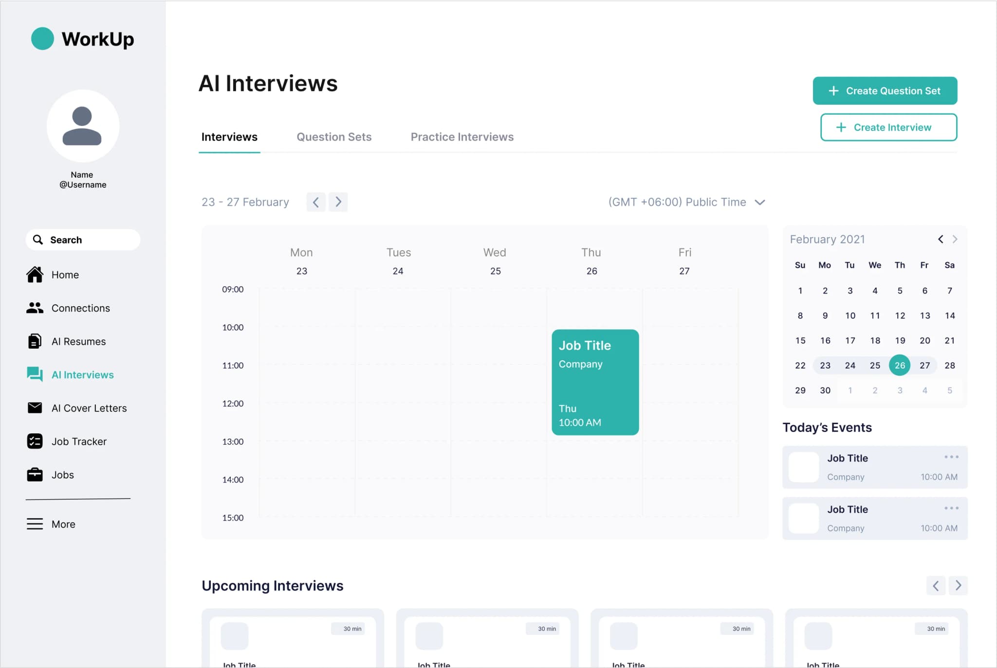
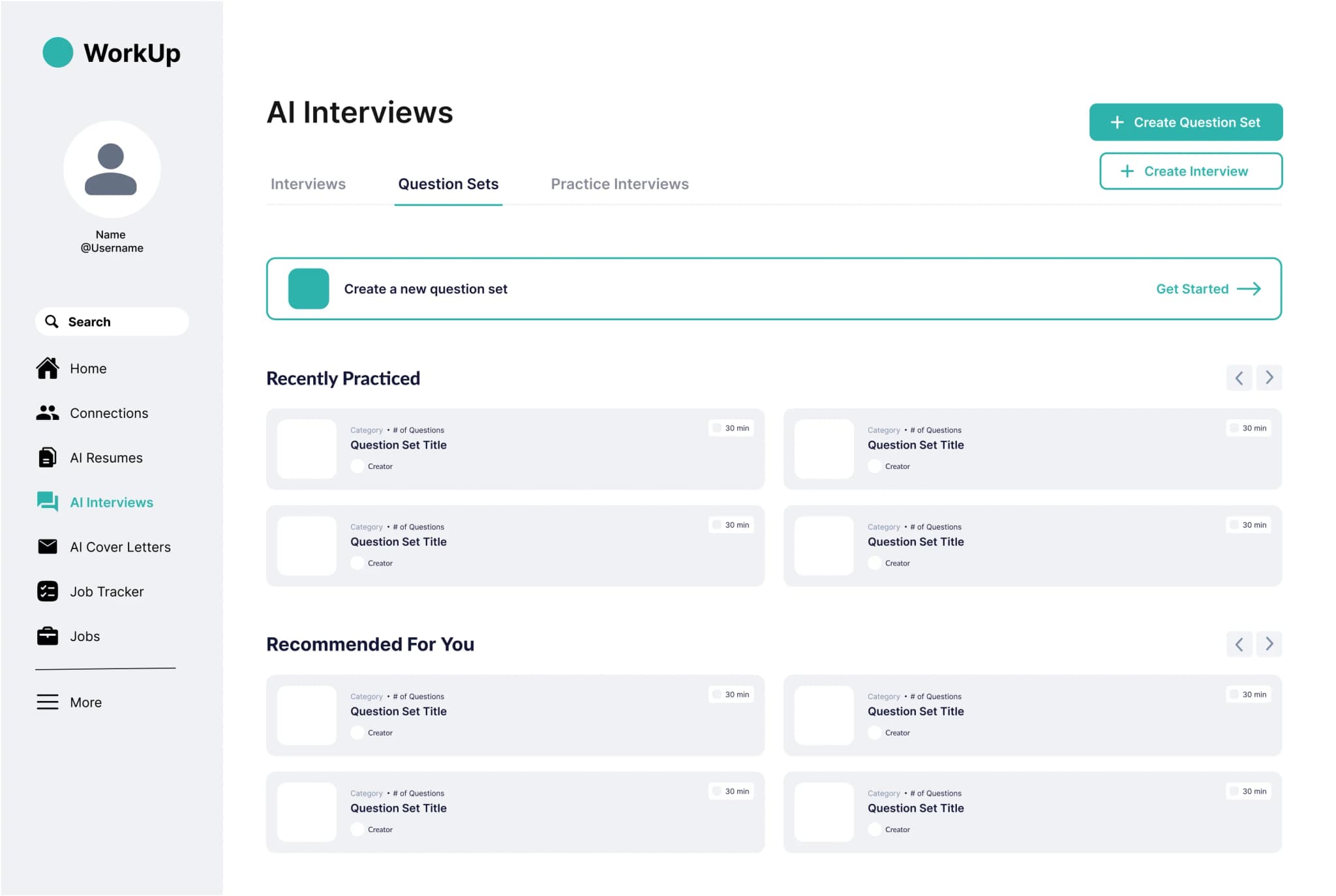
All in one place
Our team built a single "hub" for practice question sets, helping users track progress, stay organized, and prepare for interviews with purpose.
Impact
Users were 50% more likely to engage with the AI interview feature.
Simplifying the user journey prevented users from becoming frustrated with the site.
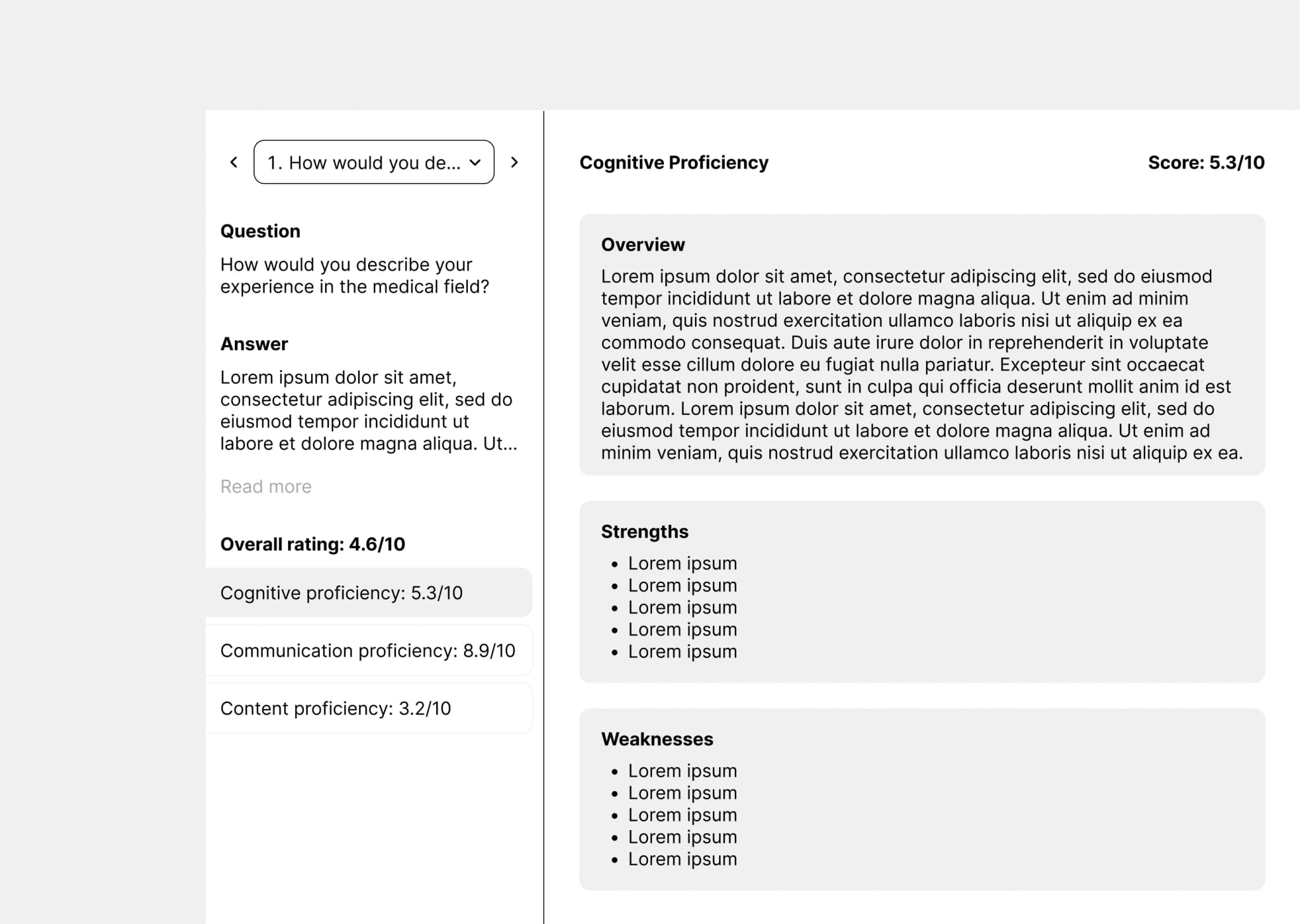
Feedback comprehension improved dramatically.
By restructuring AI-generated feedback into clear, actionable sections, users could more easily identify strengths and areas for growth.
Organizational features increased ongoing learning by 90%.
The addition of options to save question sets and review past interviews enabled users to track their progress over time.
Takeaways
User empathy is foundational.
- Spending time with real users, hearing their frustrations, and observing their interactions with the website firsthand shaped every major decision.
Sometimes the answer is simplicity.
- Simplifying the user flow made a bigger difference than any flashy features designs.